We are Phosphor Grove, an indie game publisher built on the idea that fantasy worlds can glow with quiet, cozy wonder instead of grand spectacle. That idea sets the tone for everything we make: warm, a little mysterious, and rooted in nature rather than machinery or chrome.
Our personality is cozy but serious, arcane but grounded in nature, and quietly confident. Nothing about our brand needs to shout, our glow does the talking. This tone carries through every touchpoint we put into the world, from our logo to the words that accompany it.
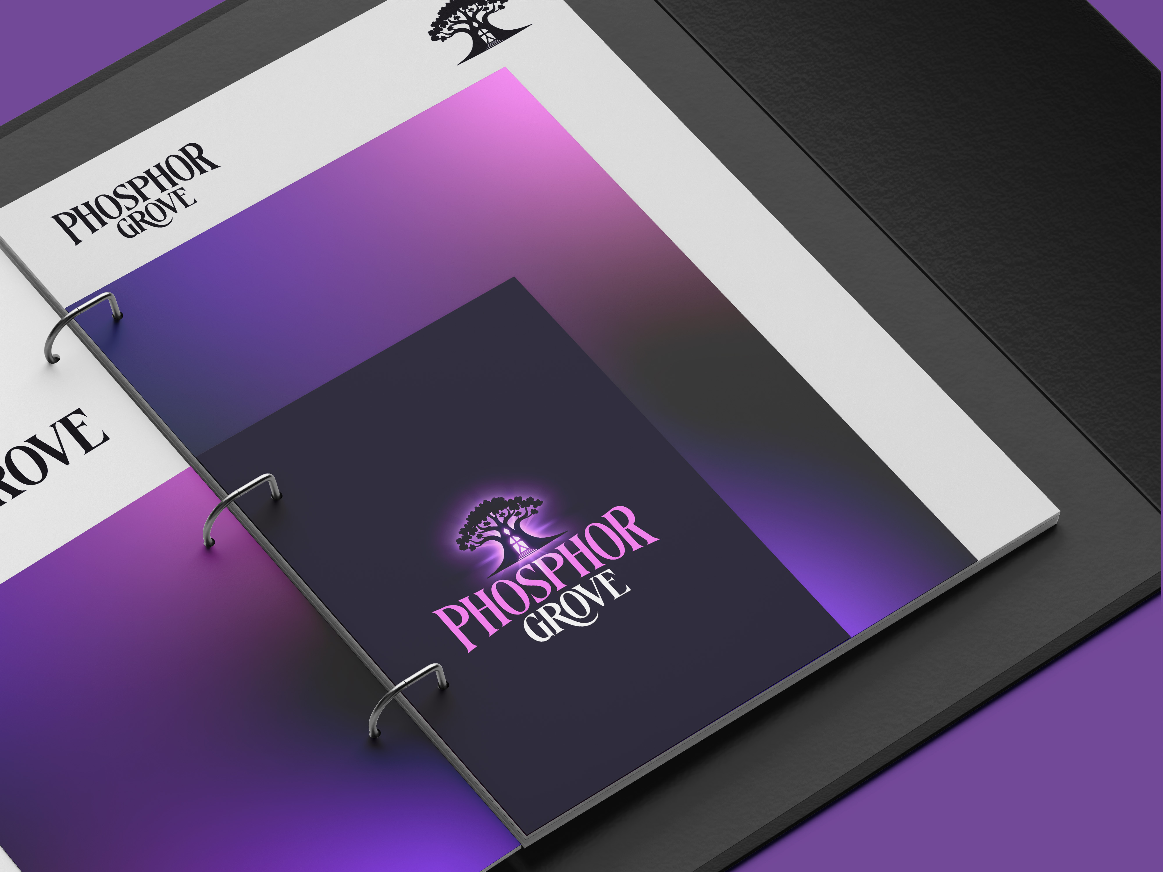
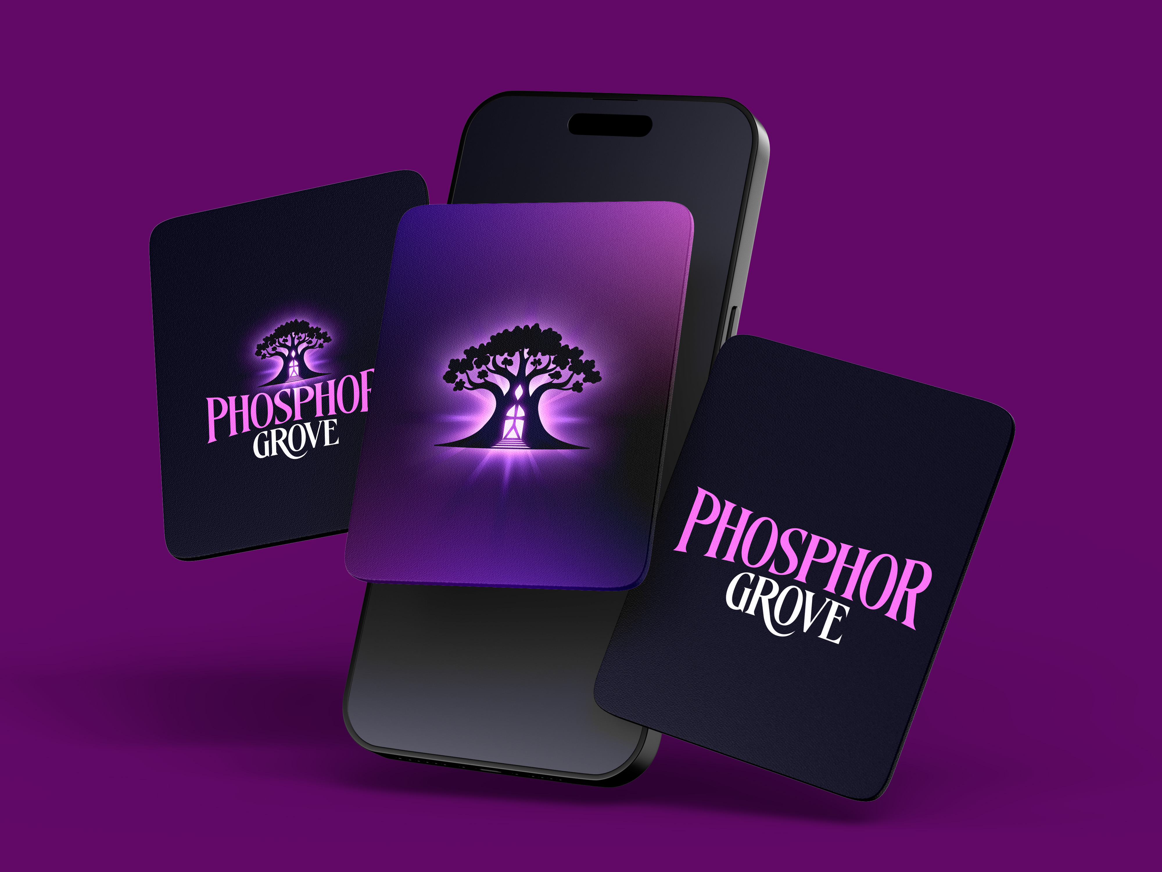
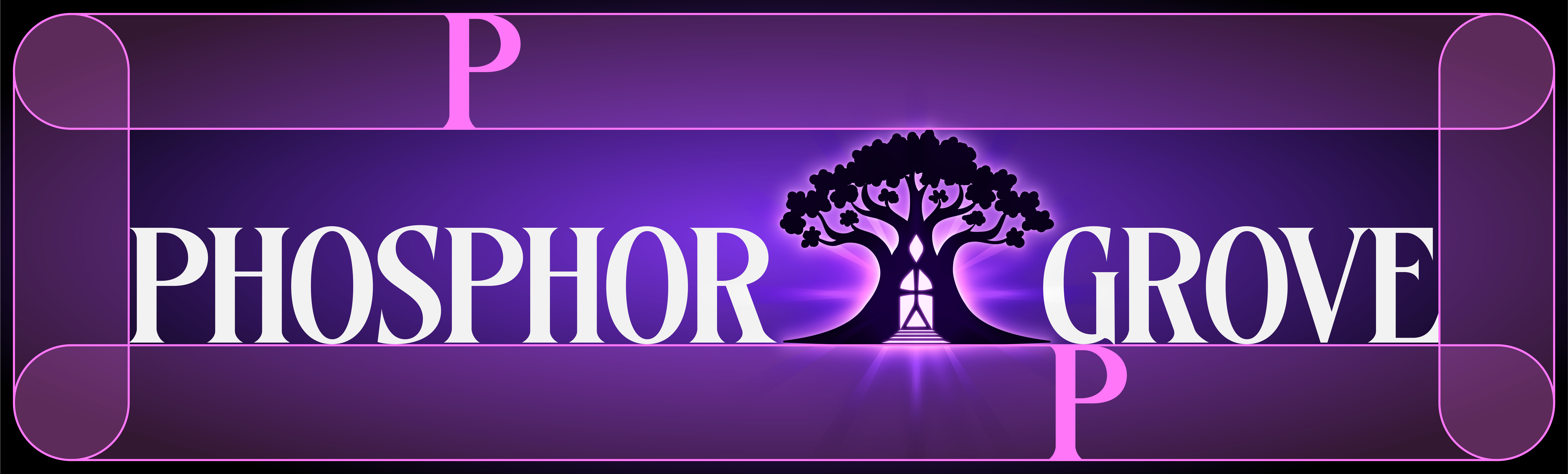
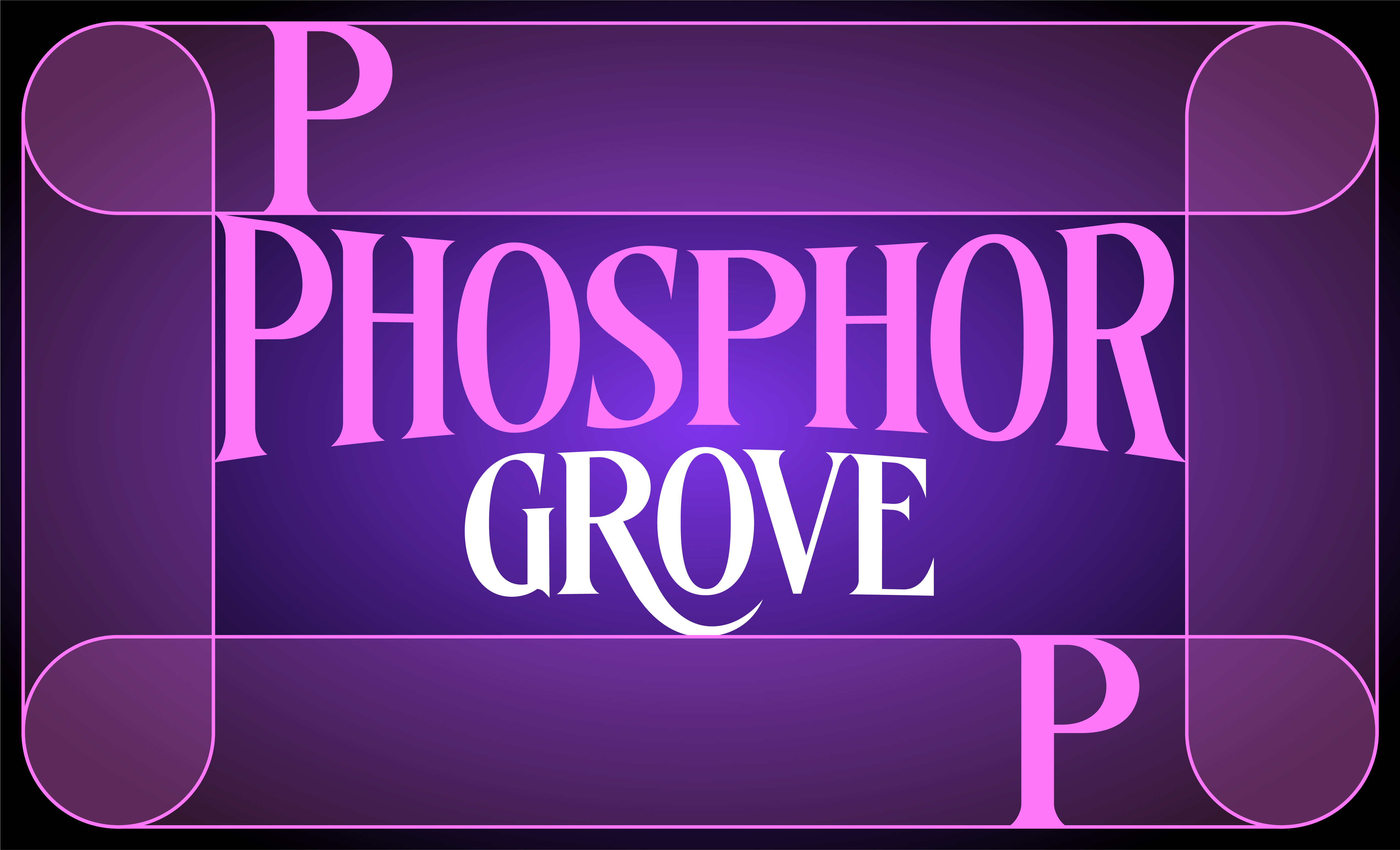
Our logo suite includes five core versions, each with its own role.
If you're not working with the vector files, please rebuild the mark in two layers rather than one flattened image: our icon mark on the bottom, our shine layer on top set to Overlay, so the glow keeps its light instead of sitting flat on the surface.
We keep clear space around any version of our mark equal to the height of the "P" in our wordmark, on all sides, free of other logos, text, or graphic elements. We don't scale our icon below 24px, below that size our glow detail and trunk symbol start to lose clarity.
Click any code to copy it
Primary Colors
Near-Black and Twilight Purple are our anchor colors, they carry the majority of every application we touch. Near-Black is our backdrop, the moody, after-dark foundation everything else sits on top of. Twilight Purple is our identity color, our tree's signature glow and the color people should associate with us first.
Secondary Colors
Magenta Glow is our brightest accent, used for alternate lockups, pattern work, and moments that need a bit more energy, it should never carry more weight than our primary colors. Deep Violet is a darker, richer version of our purple, useful for supporting graphics and shadowed areas. Forest Green is our quietest color, a muted, natural accent reserved for small supporting details.
Two typefaces carry our voice, each with a distinct job.
A premium serif crafted for an epic, mythical atmosphere: its clean, sharp structure and stylized character terminals give it an ancient yet ultra-modern feel. We use it for our wordmark and large headline moments, reserved for title treatments and key art, not for running text.
It carries clean geometry, subtle warmth, and slightly rounded corners, adjusted for excellent legibility at smaller sizes, with a versatile range of weights from light to bold. We use it for body copy, UI text, and anywhere legibility at small sizes matters most.
Type Hierarchy
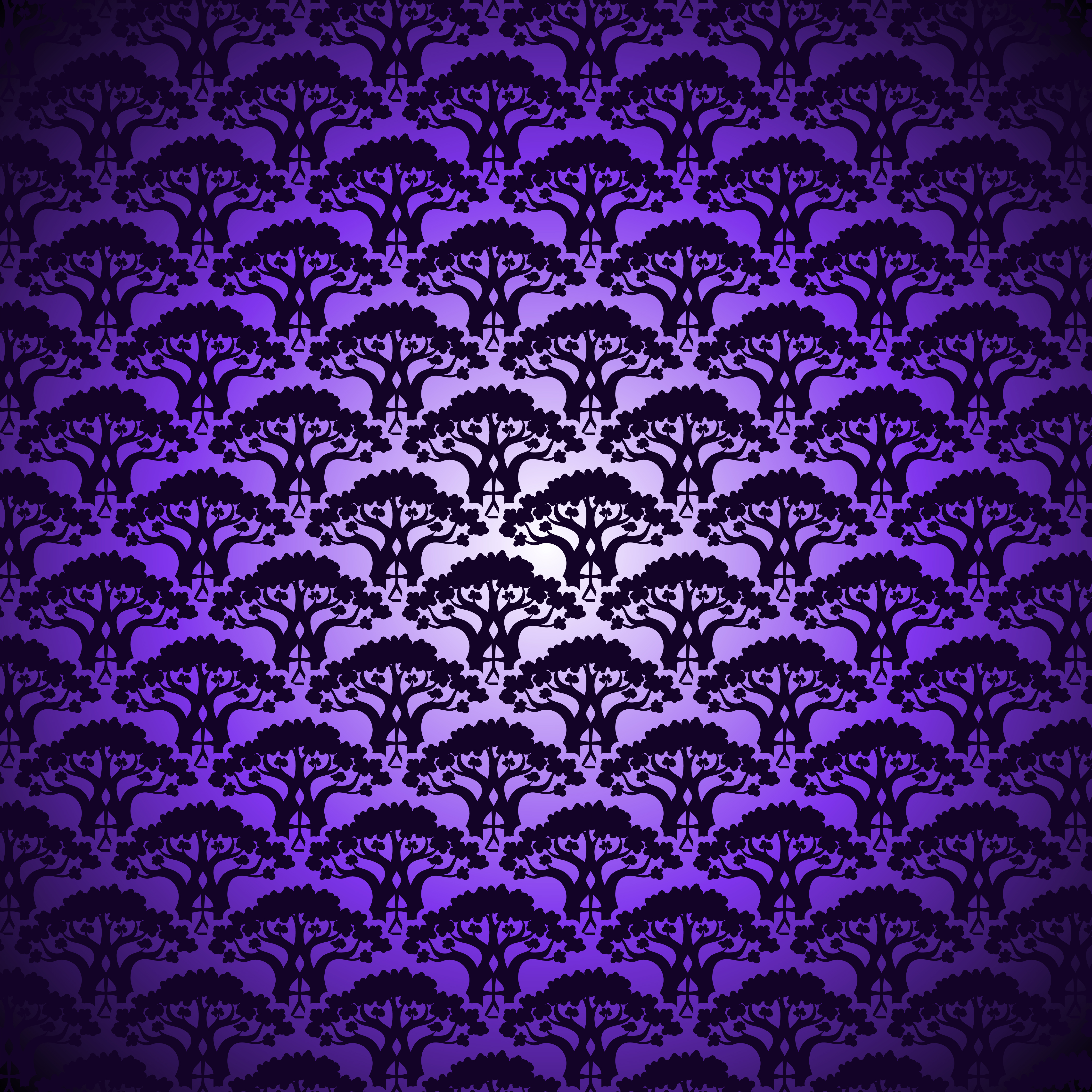
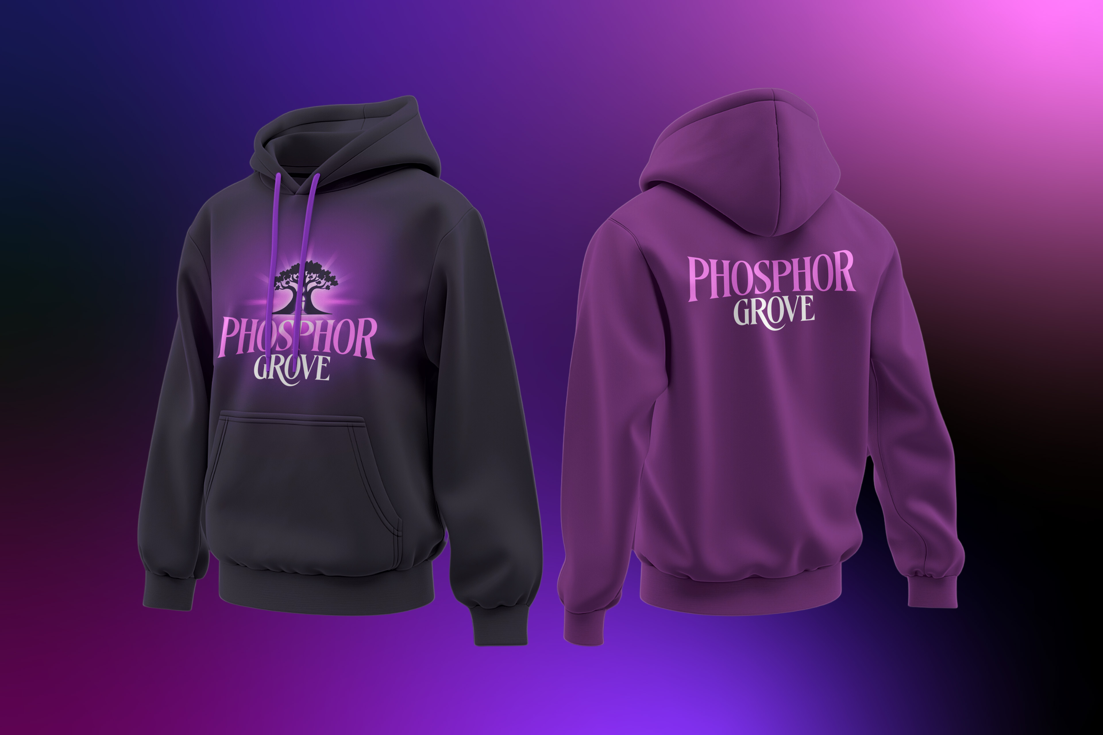
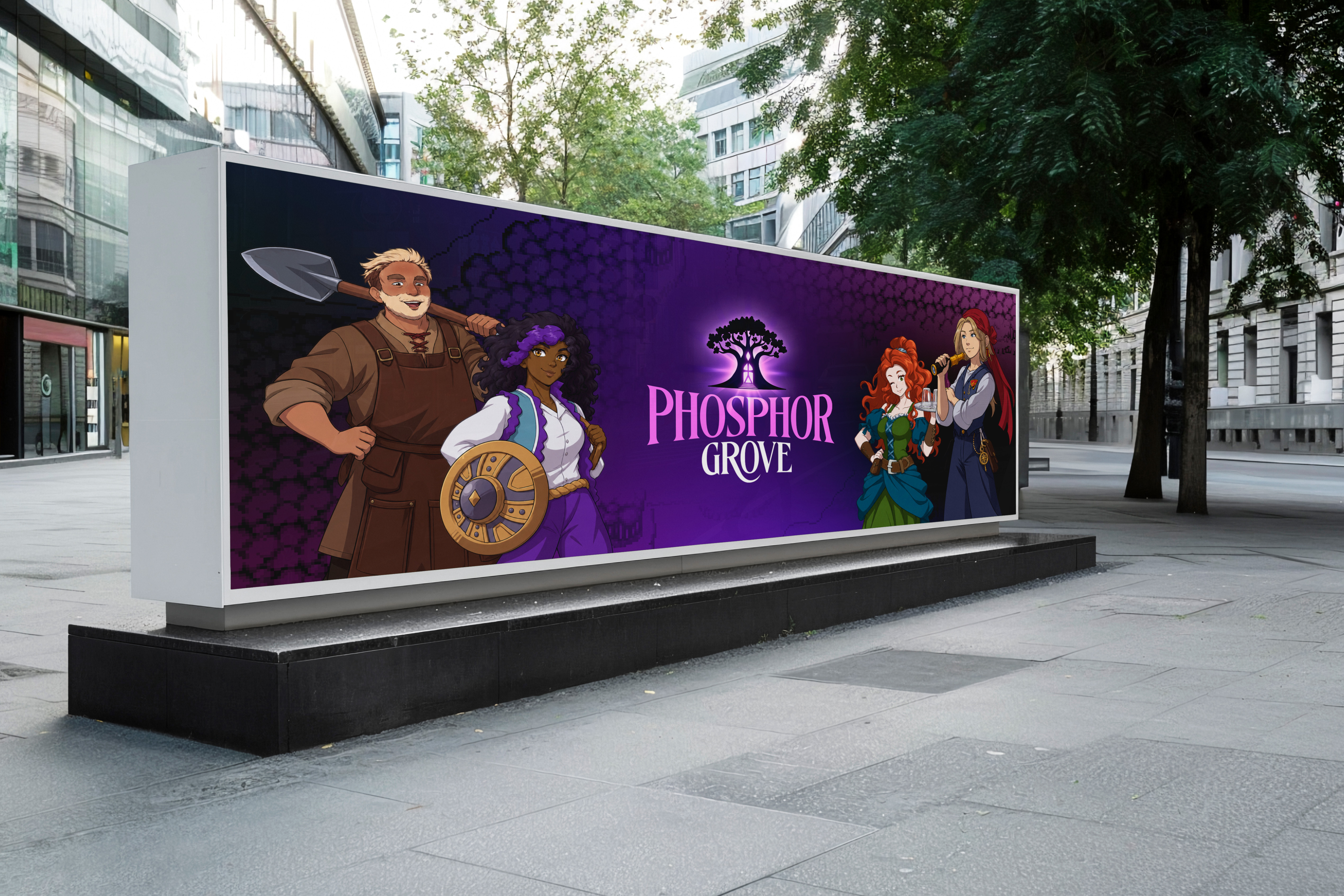
The tree icon repeated at small scale forms our signature pattern. We use it in the background, on packaging interiors, merchandise, social banners, and section dividers, anywhere we need texture without competing for attention.
We keep contrast low enough that our pattern reads as texture rather than artwork, and we keep it clear of any text that needs to stay legible.
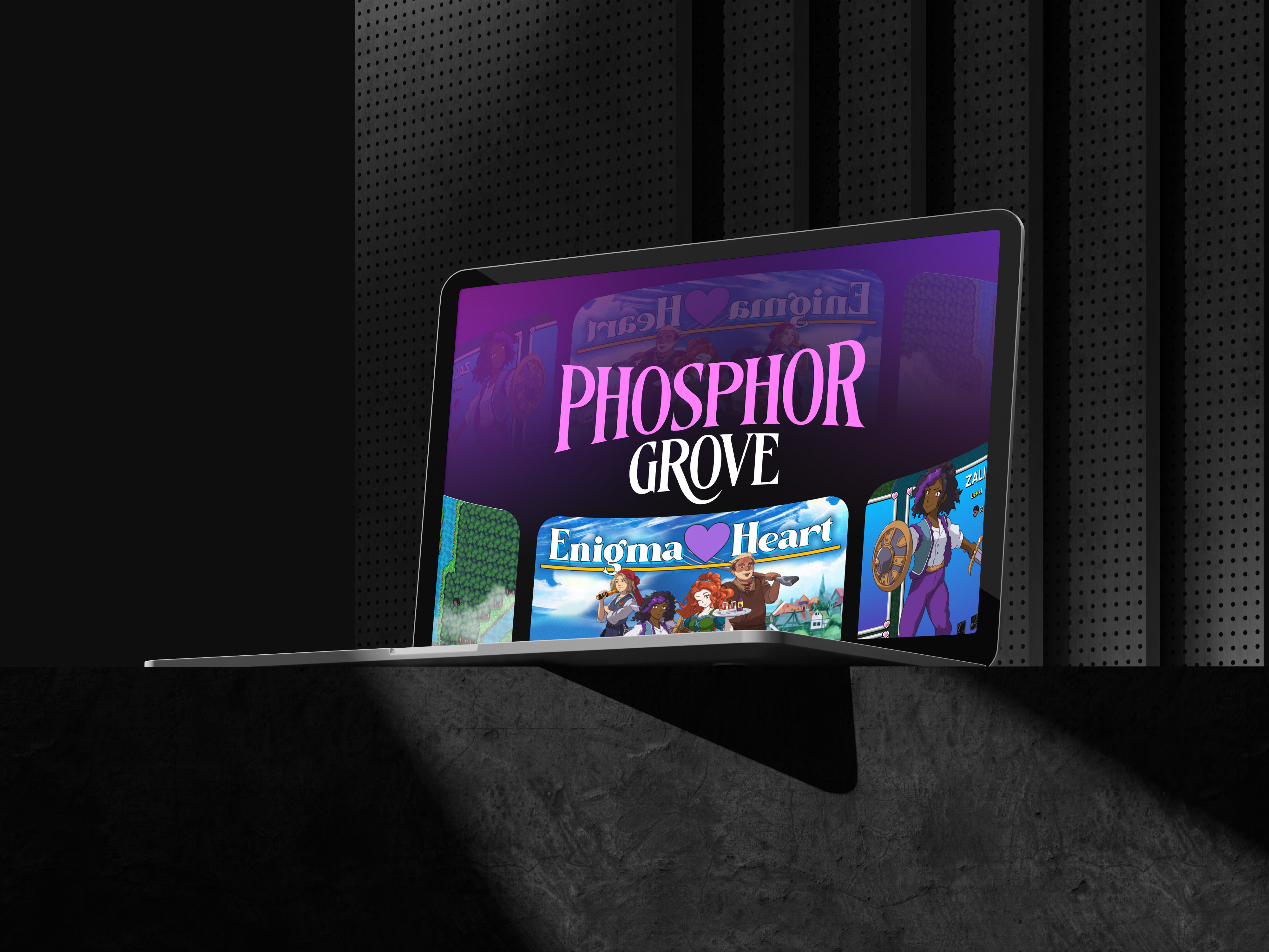
Across every touchpoint, phone, laptop, tablet, or app icon, we carry the same quiet confidence: centered, given room to breathe, and never crowded by other content. Consistency across these everyday surfaces is what makes us read as a real, established brand rather than a logo applied after the fact.